

lunar eclipse honey
Lunar Eclipse Honey is the result of some very hard-working bees and my awesome client, Emily.
The goal was to create branding that not only represent’s Emily’s passion for her bees, but also captures the unique personality of Lunar Eclipse Honey.
Using an unconventional colour palette and playful iconography, Lunar Eclipse Honey came to life.

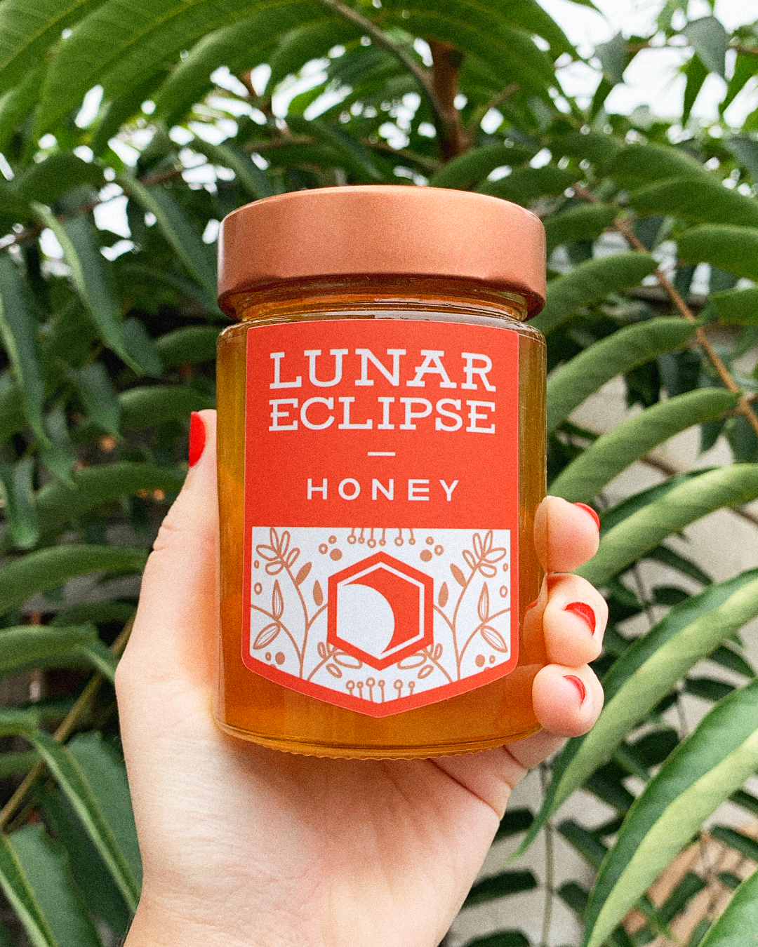
I created a label for the honey that is inspired by the edges of a honeycomb but also feels like a banner to house the Lunar Eclipse name.
The icon is a combination of a honeycomb and an eclipse, tying back to the unique name.

The colour palette is a departure from conventional honey colours. Using a striking red-orange as the primary colour helps the packaging to stand out and contrast nicely against the golden honey.
The illustration on the label is set in an earthy brown to bring in a more natural tone and speak to the organic side of honey making. And finally, a little bit of white helps everything pop!
I worked with Emily to source food-grade labels that would allow the high chroma label to shine. The real star of the show is the honey though, trust me.